Our brand name is Lepus (the name of a constellation from the Latin word shaped like a rabbit.) Why a rabbit? First of all, this is partly my personal preference, they are quite soft. Second, because the rabbit image symbolizes gentleness, agility, and sophistication, we hope these elements will become the service style the brand wants to bring to customers. Therefore, our brand was born with the name “The Lepus Coffee”

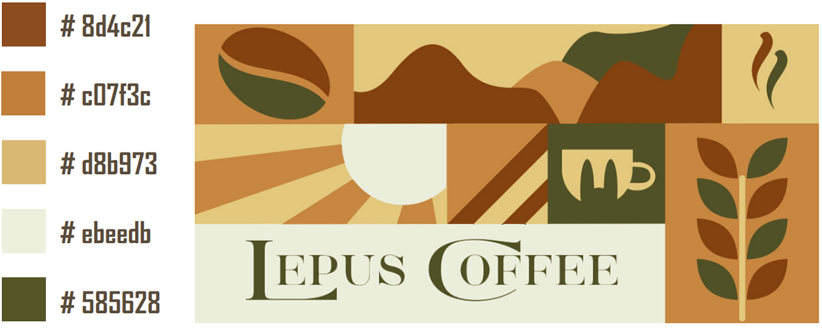
The brand logo combines an image of a rabbit and a coffee cup which can be described as a lovely and friendly symbol. The rabbit image represents gentleness, agility, and sophistication, with the hope that these elements will become the service style that the brand wants to bring, while the coffee cup represents the enjoyment of the product.
Customer satisfaction with the brand. Therefore, I think the combination of these two images creates a unique and attention-grabbing logo.

We chose the fourth option to be the main logo for the brand, it brings a friendly look to customers. Next, we added an arc around the logo to represent the sustainable element of the brand. In addition, we also decided to add the brand’s founding year to the logo to mark “this is an important milestone” for our brand.


Patterns inspired by images related to coffee and the brand bring a familiar and modern pattern to customers.